5 Things I Hate About PPV

1. When People Press “Make My Bid Highest” on TrafficVance

Like I said in another post, this is the absolute dumbest thing you could ever do. Every time you hit that button on TrafficVance, you are raising the bid price by 5x higher of an increment than is necessary. There’s nothing worse than logging in to check my targets and seeing that I have been outbid by $0.005, because I know exactly what caused it. Stop the madness now!

2. Waiting for Ads To Be Approved

It can be very frustrating waiting for your ads to be approved by the PPV network, especially with Lead Impact. At least with TrafficVance or DirectCPV, if you are very impatient you can hit up your rep and tell them to approve it. With Lead Impact though, you are stuck waiting for up to 72 hours or longer. That makes me pull out my hair.

3. A Great Converting Target with Barely Any Traffic

There are lots of little gems out there in the world of PPV targets. Great URLs and Keywords that convert like white hot fire, with an ROI of over 1,000%. The only problem is they only get one or two views a day. There is absolutely no way on earth to fix this, but they are always there tantalizing you with the promise of ridiculous profits.

4. PPV Networks Don’t Allow Download Offers

Before you start jumping down my throat, yes I know that some PPV networks somewhere do allow some download offers. But my favorite ones still like to deny my favorite kind of download offers: the very profitable ones. So that leaves me either trying to run some lame download offer that maybe might work, or running with a lesser PPV network that maybe might work. It’s not worth the hassle.

5. Bid Prices Can Be Ludicrously High On Competitive Targets

It’s no secret that PPV isn’t the cheapest form of traffic on the planet. Even at the minimum bid of $0.01 per view on TrafficVance, you are still paying $10 CPM. That is a very high price in the world of display advertising. But when people start bidding $0.40 or more per view on a target, you are talking about a $400 CPM. That is insanity! That’s not to say that there aren’t some offers that could still be profitable at a bid of $0.40, it’s just that a lot of times these bids are driven up by people who are losing money hand over fist and have no idea what to do about it.

So there you have it! My list of 5 things I hate about PPV. Be sure to take these all with a grain of salt, because as I’m sure you know, I love PPV. It’s my favorite type of traffic and that’s not going to change anytime soon. But if I could have 5 wishes come true for Christmas, it would be to change these things.

Case Study: Buying A Site on Flippa for Profit

Last month Stackman did a really cool post about buying websites on Flippa and optimizing them for profit. I have created tons of websites from scratch, but I’ve never tried to buy one before. So I took his advice, went over to Flippa and started browsing around. Here’s what I found…

There’s a bunch of crappy websites for sale!

There are good ones as well but you have to really dig through a bunch of crap to find the good stuff. I don’t think I was prepared for all of the retarded sites for sale at outrageous prices, but I got used to it. I ended up bidding on two different sites that I thought had potential.

Flippa

If you haven't ever been to Flippa.com, you should check it out!

The first site ended up being highly competitive, and went for $3,200. I didn’t want to spend that much my first time out, so I let that one go. The problem was it was already too far developed and had affiliate income already set up on it. Honestly I’m not sure why the guy was selling it, unless it had just been sandboxed or something… Anyways, on to the next one.

The second site had about 15 bids on it as well as a Buy It Now price of $500. After doing some due-diligence and researching the niche and the site’s traffic, I decided to go ahead and buy it. I’m sure I could have gotten a better deal by waiting for the auction to finish, but I’m pretty impulsive when I get an idea into my head so I just bought it for the $500 BIN price.

The reason I liked the site was that it had a lot of content already generated. It has over 2,000 pages in it. That saves me a lot of work on the front end so I can focus on getting it traffic and monetizing it. It doesn’t have a blog, so I will probably add one of those shortly and put some more content on it. It also had quite a few backlinks already going to it. It has a PR of 0, but the groundwork is still there. It should be fairly easy to get it up to PR 2 or PR 3 in the next couple of months.

AdSense was the only type of monetization on the site, and there weren’t very many ads at all. I went ahead and placed a 468×60 banner for an affiliate offer in the header, and spruced up the AdSense locations. I will most likely build an email list as well so I can mail offers to my users.

That’s all I’ve got to report for now. I’m excited about the project and hopefully it will be a good long-term source of income. It gets old doing the affiliate campaign grind after a while, so this has been a fresh breath of air.

The Big 5 PPV Networks: A Comparison

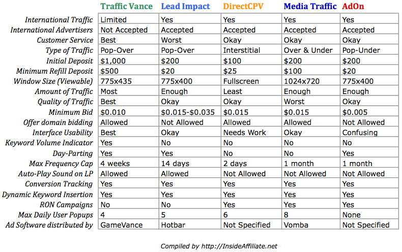
A lot of people that are just getting into PPV ask me what PPV network they should use or what’s the difference between the different networks. I decided to put together a handy comparison chart here so you can see which one is the best for your particular situation.

PPV Network Comparison

PPV Network Comparison (Click to enlarge)

Right-Click here and “Save As” to download the chart!

How To Cherry Pick The Best Offers For PPV

This is a guest post by the UK affiliate sensation, Finch. In case you’ve been living under a rock, he blogs at FinchSells.com. I can honestly say he is one of the smartest guys in our industry. Do yourself a favor and add him to your RSS reader ASAP.

Hello Victim

There’s only one serious problem I’ve found with PPV marketing. It offers too much freedom.

As an affiliate marketer who’s accustomed to working within the confines of what a Facebook intern deems acceptable for publishing, taking the leap to PPV can be a little daunting. I’m so used to covering skin in my dating ads, or being careful not to call out user attributes, that I don’t always know what to do with a clean slate. I’m like a starved kid in a sweet shop when I sit down to ponder the possibilities.

I think many affiliates are in the same boat. We know PPV is one of the few remaining advertising platforms for our last generation ads. But without imposing any strict limitations on the affiliate’s campaigns, it can be hard to find a starting point.

If you’re looking for the motivation to get stuck in to PPV, you obviously need to select an offer first.

As a guy who’s established a reputation for working heavily in the dating niche, I regularly get asked if I promote dating offers on the main PPV networks. The answer is yes, but very selectively. It’s not as easy to promote dating with PPV for one simple reason. You have very primitive control over your demographic targeting.

A lot of experts in the field will tell you that demographic targeting is as simple as taking your ass to Quantcast, running a few searches, pretending to soak up the information and then launching the same campaign you had in mind anyway. Well, nice work if that’s the case. You really should have been a scientist.

My problem with using even the most sophisticated demographic analysis tools for a dating offer is that the percentages are still against me. Even if 75% of the audience on a given URL is male and single, 25% is a huge waste of eyeballs. PPV can be a cheap marketing vehicle, but don’t let anybody fool you. For a niche like dating, it’s NEVER as cost-efficient as a well planned CPM campaign.

The secret to success with dating ads on PPV is to take one of two paths:

1. Only targets URLs and keywords where you have sufficient assurance that the large majority of users are going to be in the boundaries that are accepted on your offer. Here’s a tip, hot shot. Don’t go trying to promote an offer like Mate1 25-30 year old female users only. You’re digging your grave by narrowing the goalposts.

2. Produce creatives that are unisex, suitable for most ages, and targeted to most needs. If you’re going to target a broad selection of URLs, you’ve got to be able to pop a creative that captures and hooks as many of the demographics as possible. Now there are ways you can do this. My personal favourite is to capture the user’s information, rather than sending them directly to an offer. Use a dropdown box to allow the user to select his/her age then perform some quick PHP “if else’ing” behind the scenes to match said user to an appropriate offer.

The third option would be to avoid dating ads altogether. And this is actually what I would recommend for most newbie PPV marketers.

In my opinion, the easiest way to succeed with PPV is to work with niche offers where the user’s demand for a solution is at the “ready to buy, just get rid of my damn problem” stage.

We could use the recent bed bug repellent offers as an example. Now I don’t live in America so I can’t honestly report whether my sleep has been disturbed by bugs in the night, or whether it’s as big a problem as the international media has made out. But from my understanding, bed bugs are becoming a pain in the arse across the pond.

The reasons I would choose something like a bed bug repellent for a PPV campaign are three-fold.

1. Where there’s a demand, there’s an affiliate marketer. If somebody thinks they have bedbugs, they’re going to flip out and buy something in a hurry. Nobody wants their blood sucked from them in the night. Not even Finch is that kinky. So it’s the kind of campaign where you really don’t have to do much work to inspire the user to whip out a Mastercard. Target, fire, reload. Just the way we like it.

2. It’s pretty easy to target the users who are actively searching for a solution. How many other reasons do you have for Googling pages about bed bugs? It’s not something I’ve been forced to add to my LeechBlock.

3. The offer is not tied to demographics. The beauty of bed bugs is that they’ll bite the crap out of anyone. It’s an affiliate marketer’s sweetest dream! We should be welcoming them in to our neighbourhoods with open arms. No more demographic targeting. The only targeting you need is “Hello, Victim… Want To Stop Itching Tonight?”

I’m using pretty niche examples here, but the idea is simple. The best way to deem an offer’s suitability for PPV is to weigh up those two important factors. Is it an impulsive buy? And more importantly, can you guarantee enough interested eyeballs from your targeted URLs? If you’ve got no control over your demographic, you’ll become a sucker of your own creative license. PPV offers a lot of freedom. But it makes no sense to lack discipline with your efforts. This is a platform that punishes bad marketers and sloppy marketing.

Size Matters: PPV Landing Page Dimensions

As I’ve written about before, you need to get their attention in 4 seconds or less when you are doing PPV.  A huge part of this has to do with your landing page.  If you are direct linking, you need to pay special attention when selecting offers to make sure that the call to action and all the pertinent info is appearing in the viewable area of the pop-up browser window.  If it’s not, there is very little chance the users are going to scroll down just to see what the deal is.  If you are building landing pages, you have absolute control over the size and appearance of your page.  This is probably the #1 reason that people make landing pages for PPV, besides getting people more excited and getting them clicking.

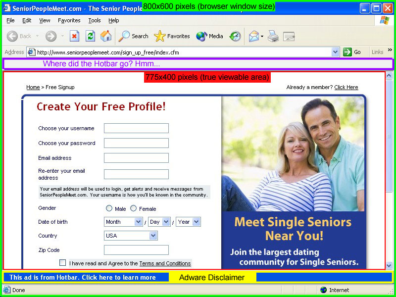
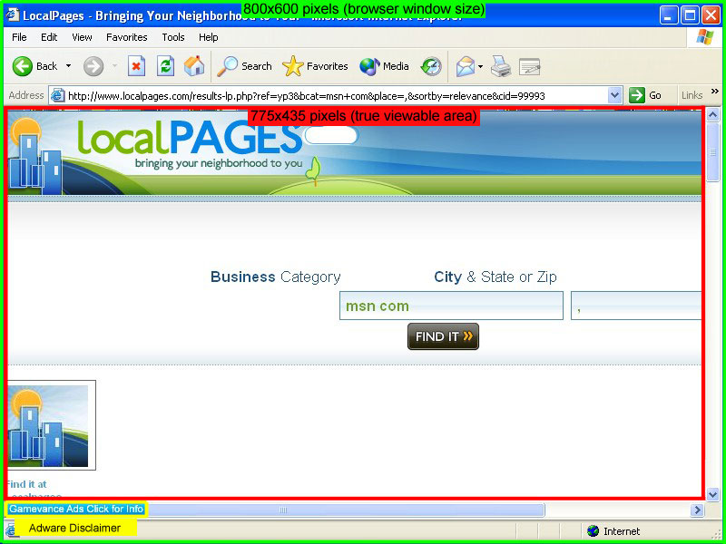
One question I get all the time is how big to make your pages.  It’s common knowledge that the pop-ups generated by PPV software are an 800×600 window.  But does that mean that you should design an 800×600 page?  The answer is NO.  I grabbed screenshots of some actual pop-ups spawned on my two favorite PPV Networks, TrafficVance and Lead Impact.  I’ve diagrammed them below so that you can see exactly what is going on.

Lead Impact Pop-Up Window

Lead Impact Example

Click Image for Full Scale Version

TrafficVance Pop-Up Window

TrafficVance Example

Click Image for Full Scale Version

First we have the actual browser window, which is definitely 800×600.  However, that measures from the outside of the window.  The actual viewable area is much smaller.  As you can see below, the TrafficVance window has 35 more pixels of height to work with in the viewable area than the Lead Impact window does.  This is because of the extra space that the Hotbar toolbar takes up in the Lead Impact window.  Is it retarded that Lead Impact leaves the Hotbar app in the window that it pops?  Yes.  It’s the stupidest thing ever.  But that’s the way it is.  Weird thing is, when I took the screenshot, the Hotbar magically disappeared from the picture.  It just shows up as a blank toolbar.  Interesting…

Not only does TrafficVance have a larger true viewable area, the Adware Disclaimer is also a lot smaller.  It’s just in the bottom left corner of the screen instead of a big blue bar all the way across the bottom like Lead Impact has.  The other major factor to keep in mind when comparing these networks is that TrafficVance only pops a maximum of 4 windows per day.  On the other hand, Lead Impact will pop on almost every single website that you visit.  This gets really annoying, even for me while I was doing the testing.  I can’t imagine how people leave it installed on their computer all the time…

So there you have it.  I always find that when going into battle (and marketing is a battle), it helps to have the best intelligence you can.  Now you know exactly what dimensions to design your landing pages in, or to double check that your direct link offers fit into.

Pro Tip: If you want a really easy way to measure how large the landing page is for your affiliate offer, just download ScreenHunter Free and set it to “Rectangular Area” in the “Capture What” menu.  Then hit whatever key you setup to be your capture key (I use PrintScreen), a box will appear around your mouse that zooms in the detail.  Just click and drag to highlight the landing page and it will tell you the dimensions.  If you want to go ahead and capture the screenshot, just let go of the mouse button.  If you don’t want the screenshot, just right-click before you let go of the left mouse button.

Uber Pro Tip: ScreenHunter is only for PC users.  But Mac users don’t need it because they already have that same function built-in to OSX.  Just press Command + Shift + 4 then you will be able to use the same type of rectangular box to measure your page.

Don’t Push “Make My Bid Highest”. Ever.

If you are reading this right now and you are a PPV marketer, we need to come to an agreement on something.  I know when it’s late and you are about to go to bed, it can be tempting to log on to TrafficVance and hit that shiny “Make My Bid Highest” button just to make sure that you are getting all of the traffic.  Too bad.

evil button

Every time you push that button, you are just handing money to TrafficVance or DirectCPV or whatever network you are using.  See, it doesn’t just automatically figure out the least amount that you would need to bid to get the #1 spot, it overbids it.  A lot.  Like 5 times more than you could have been paying.  It only takes $0.001 (that’s a tenth of a cent) to outbid someone.  But when you hit the evil button, it raises your bid by $0.005.  That makes TrafficVance happy, but it makes us pay too much money.

So let’s all just agree right now to take the extra 30 seconds it takes to log on, check the rank for our top keywords and URLs, and add $0.001 instead.  That is all.

Instantly Increase Your ROI By 2%

I know what you are thinking.  A measly 2% increase?  What’s the point?  Ask anybody that is making six figures a month with Affiliate Marketing if they’d like an extra 2%.  Of course they would!  That’s an extra $2,000 in their pocket every month.  Sometimes in life it’s the little things that add up.

Possibly the most annoying post image ever

This trick only works with PPV.  And it only works with a couple of networks: Lead Impact and Media Traffic.  All you need to do is go to the Billing/Funding page in your account and switch on Automatic Funding.  This means that when your balance drops below a certain threshold, they will automatically charge a set amount to your credit card to refill your account.  For doing this, they will give you a free 2% bonus on the amount you deposited.

It’s free money, sweet and simple.  If you are worried about your card getting charged unexpectedly, just pause all your campaigns when you are getting near the threshold.  You can keep them on pause indefinitely until you are ready to run again.

PRO TIP: If you use a credit card that gives you cash back, you can get another 1% back for free on all of your traffic purchases on any network.

Get Their Attention In 4 Seconds or Less

Another way to look at PPV marketing is interruption marketing.  That’s essentially what you are doing is interrupting them in the middle of their web surfing session and popping an ad in front of them.  What you have to say had better get your point across, and do it quickly.  Let me introduce you to the Golden Rule of PPV Marketing…

Get Their Attention In 4 Seconds or less.

That’s right, only 4 seconds.  That is the average amount of time it takes a user to mouse up and close the pop-up window or click “skip” on your interstitial ad.  Doesn’t sound like very much time?  It’s not.  That’s why you have to do everything in your power to keep them on the page and engage them before habit takes over, which is to close the window.  How do you get their attention?  Here are a few ways.

1. Audio

You can only use audio on your landing pages on two of the major PPV networks: Traffic Vance and Lead Impact.  Traffic Vance doesn’t have too many restrictions on audio, they are quite lenient.  However, Lead Impact requires that there be clearly visible controls to pause or stop the audio.  This is simple to do if you have the right software on your landing page.  The audio player I see being used the most often is Nifty Player.  It is lightweight, fast-loading, and you can have the controls on the page or keep them invisible if you choose.

2. Flashing Graphics

Take some cues from the animated flashing .gif banners that you see used on many of the blogs in this industry (like this one!).  It is super easy to make a 2-5 frame flashing .gif banner using Photoshop, but that’s a topic for another post.  There’s a great tutorial you can read here.  You can use this tactic to make flashing headers, blinking call to action buttons, and moving arrows to get the attention of the user quickly.

3. Use Opposing Colors

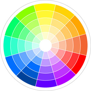
One way to catch the eye is to use opposing colors.  Using this color wheel you can easily pick colors on the opposite end of the spectrum, which makes pages much more eye-catching.  You probably don’t want to do anything too abrasive, like use one color for the background and then another for the text, that would just be annoying.  What you can do is use them for different buttons, arrows, or calls to action on the page.  Or when you make your animated .gif files you can use opposite colors and flash between them for maximum effect.

Using one or all of these tactics is a great way to get the user’s attention in 4 seconds or less.  Try these out, and you will definitely see a difference in your conversions.  Just put yourself in the mind of your user and ask yourself, “Would I close this window in 4 seconds?”

Clean Up Those URLs

If you are running PPV, you are most likely scraping URLs. If you are scraping URLs, then you have probably wasted money on bad targets.  I certainly have.  Here’s a money-saving tip that will keep you from blowing through your testing budget bidding on google.com or answers.yahoo.com:

Go through your scraped URLs before you launch the campaign!

Scrubbing Bubbles

Nobody has cleaner URLs than this dude...

Yes, I understand that if you are targeting thousands of URLs, it can be time consuming to go through them one-by-one.  But here’s the trick: you don’t have to!  If you have your list loaded up in Excel, just press Ctrl + F to open up the Find menu, and then search for the usual culprits:

google.com, facebook.com, yahoo.com, wikipedia.org, etc.

Alternatively, if you are using AffExpert, you can filter these domains during the scraping process.  Just click the “Show/Hide Domain Filter” button on the URL Scraper tool, and it will open up a second box where you can put in the URLs you want to filter out.  Done and done.

So there you go, a simple tip that can easily save you $20 a campaign or more.