GTmetrix: This Is Your Site On SPEED

It has been mentioned before on this blog that landing page loading time matters. Each precious second that you shave can mean more dollars in your pocket. I always thought that I did a pretty good job of keeping my landing pages fast. I used small, optimized images, had a good server, etc. But that was before my friend Rohail introduced me to GTmetrix.

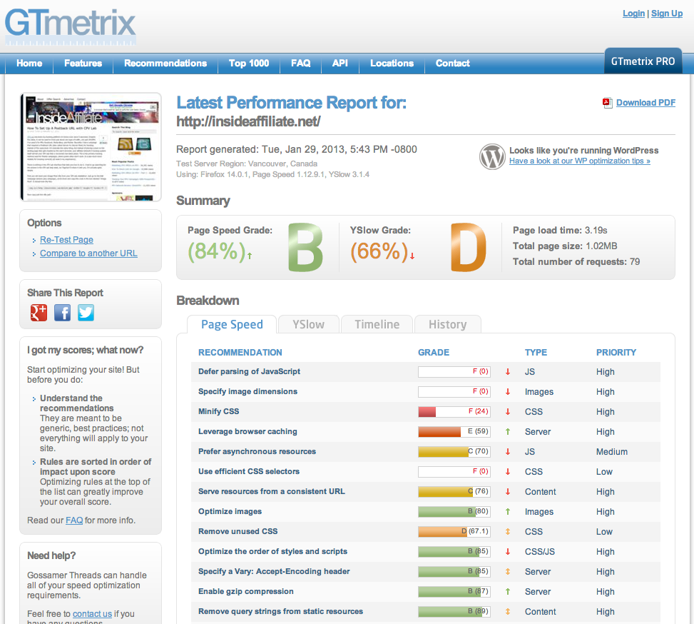
I was skeptical at first, but it looked simple enough to try. All you need to do is put in your landing page URL and press go. So I did. GTmetrix analyzed my site in a few seconds, and it came back with a grade of C- for my page. I was surprised, since I thought it was loading pretty quick at 1.5 seconds. But the truly amazing thing about GTmetrix is how much detail they give you about how to speed up your site. They have it all laid out from the top factors affecting your speed down to the smallest ones. And everything that they suggest comes with more info about how to do it. For example, one of the suggestions for my site was to minify the javascript files I was using. All I had to do was click on the links for the minified code that it generated for me, replace my code with it, and upload it to my server. It took about 30 seconds to complete. They’ve also got a lossless image optimizer built in. If your images are too big, just download the optimized versions and upload them to your server. Simple. When I was done completing the high priority tasks that GTmetrix suggested, I re-tested the page. I was blown away! The load time was now down to 0.6 seconds. A few simple tweaks had cut my loading time in half, and then some.

GTmetrix Screen Shot

Looks like I’ve got some optimizing to do on this blog…

So how much does this tool cost? Absolutely nothing. It’s free. Bookmark it now and do yourself a favor. I use it on every single lander I do now, and it continues to amaze me how quick my landers are loading. If you take the time to read the info on how each tweak actually works, you will learn a great deal about better coding and web server best practices as well. I can’t recommend this site enough, and thanks again to Rohail for turning me on to it!

Why Landing Page Loading Time Matters To Affiliates

This is a guest-post written by Kate Carpenter, the lead designer over at the web-oriented design and development studio, Fireworksable.

What are page loading times?

I assume that simply by reading the phrase “page loading times” most of you understand what it means, but for those who don’t I’ll elaborate:

The page loading time is the time it takes for a web page to complete loading of that it’s content in a visitor’s browser. The time it takes to load a page increases as the file-size’s of the it’s content increases.

Making sure that page loading times are optimized should be a key concern of developers, however when you hire a cheap freelancer from Digital Point or Elance to put together your landing page or website, it’s often not taken into account, ultimately at your own cost.


So, why exactly do page loading times matter to me as an affiliate?


If you don’t take into account how fast your page loads, chances are you’ll experience a higher bounce-rate and lower conversion-rate than you would had you optimized properly, due to:

Impatient visitors, which tend to make up the majority of us.

In this day and age, we’re used to getting stuff done very fast. That’s why when we visit a web page that appears to load slowly, even if it’s just by that tiny little bit, we’re very much inclined to hit the back-button.

Google and it’s various algorithms.

Google search now takes into account the loading time of a page when ranking pages, so if you get a lot of visitors from organic search, you could see your primary source of traffic start to slip away.

It also plays a part of your “Quality Score” if you’re using Google AdWords as an advertising platform to run PPC campaigns (NB: I think I read it only effects the search network and not the display network, but I’m not entirely sure).

What can I do to improve my page’s loading time?


Here’s two things you can do to improve the loading time of your web pages pretty significantly without diving too much into the technical side:

Compressing those images of yours.


Images are by far the biggest contributor an increased page loading time, as they tend to make up the majority of a page’s content in terms of file-size. Compressing an image allows you to remove unnecessary little bits of data from it, and reducing it’s file-size.

For the average affiliate whose not too technical, the best way to compress images is by using Yahoo!’s SmushIt, image compressor.

“Minifying” any JavaScript you’ve got.


Often JavaScript files can contain additional comments, white-spacing or code indentation that pumps up their file-size. Removing these additions is called “minifying”.


Again, for the average affiliate whose not too technical, a great way to “minify” JavaScript files is by using Google’s Closure Compiler.


Some final words on the subject of page loading times…

You can also calculate your page loading time on a scale of 1 – 100 by using Google Page Speed, as well as advice for improving loading time, specific to your page.

In all seriousness, I really recommend that you check out the resources I’ve mentioned in this guest-post, as it shouldn’t take you much longer than 10 or 15 minutes to compress your images and “minify” your JavaScript, and while the impact won’t be a 200% increase in conversions, it will certainly be worth far more than the time spent doing it.

When EPC Isn’t The Most Important Thing…

When affiliates first get into this industry, they are usually always in search of offers with the highest payout. They figure if the payout is higher then they will automatically make more money. Obviously that’s not the case, since people can bank with $2 gaming offers even harder than someone running a $50 free trial offer.

A much better metric to go by is EPC (earnings per click). If you are making $0.50 a click on an offer, that is much better than $0.25 a click, right? Seems simple enough. It’s true, EPC is a much better measurement of the quality of a campaign that simply going by the offer payout. But is it the absolute best method? Nope.

Here’s the problem. Even if an offer gets $0.50 a click instead of $0.25 a click, you might still want to run the $0.25 offer. Why? Because it may get more clicks. This is where eCPM (estimated cost per mille, or estimated cost per thousand impressions). This one can be a bit trickier to figure out than EPC, where you just divide earnings by the number of clicks. But if you are willing to do the math, eCPM will give you the most accurate picture of which offer makes more money.

Here’s how to figure your eCPM:

eCPM = (revenue/number of impressions delivered)*1000

This really works to find out which offer is working the best for you on a landing page with multiple offers, or if you are split testing two different offers on a landing page. It doesn’t really work if you are just direct linking, unless you are doing PPC and you want to count your ad impressions as the impressions, but that gets a little dicey. So if you are using landers, get calculating and see what you find out, you may be surprised by the results.

How to Strategically Create and Optimize Landing Pages

This is a guest post by Danny Schwartz, lead designer at landing page design team WePixelate.

As a landing page designer and former affiliate, I’ve got the best of both worlds and a ton of knowledge when it comes to creating and optimizing landing pages for conversions.

One thing I’ve come across time and time again in the affiliate industry is that unlike traffic sources, people tend to not approach landing pages and optimizing with a degree of strategy. Perhaps this is because people in general tend to look towards increasing traffic to increase profits rather then optimizing landing pages, or perhaps it’s because there doesn’t seem to be an exact logical path one can take when designing landing pages to ensure that they achieve the maximum level of potential they possibly can.

People tend to approach landing page optimization and creation with the mindset of “oh, I’ll just change out that call to action there” and “hmm, let me try a pink background instead of white”, essentially it’s an approach which favors tracking random elements, as oppose to tracking elements that have a logical basis for being changed.

What do I mean by this? I mean start thinking strategically about which elements are going to have the biggest impact on your conversions, and change them, not the color of some random icon on your page.

Here’s a little insight kind of steps I take to create and optimize landing pages for my clients. I will be throwing in an example of a dating website for a campaign that is specifically targeted towards males that are between 30 – 35 for a Facebook campaign.

  • Create 6 or so completely different styles of landing page, that all deliver exactly the same message, for example “Free exclusive account, only 1 left, find your match now” with a description of the account they will be getting. One page may for example contain a picture of a 30 year old professional kind of guy making out with a similar girl, another may contain a set of pictures of girls who are “using this service”, another will have a picture of a really sexy girl lying down, each page having a different call to action and fonts and what not. Point being, each page is drastically different, with the only similarity being the message.
  • Once my client has tested each one to a reasonable standard, e.g. 100 clicks, I then take the best converting page and change out the message that’s delivered to the visitor, taking the offer they’re looking for and spinning it into a different perspective, so for example I’ll have “We’ve got the kind of women you’ve only dreamed of” or “Women so sexy that you won’t need to Facebook stalk people any more” or “Over 1,273 people have found their perfect woman”. Point is again, drastic differences so that differences can really be felt.
  • My client then tests each new page to a reasonable standard, e.g. 100 clicks and tells me which one is converting the best. I then take that page begin changing smaller elements and working with the client to do back and forth tests, until we reach a point where continuing to optimize is no longer worth mine or my clients time, e.g. where any changes are too small to make any significant impact.

This is what I define is a strategic way to create and optimize pages. Unfortunately, being affiliates, there’s a certain “peak” level, where optimization becomes ineffective due to merchant landing pages play a significant if not, the most important role in attaining those conversions. Pre-selling and pushing visitors to make a purchase or fill in a lead form is one thing, but ultimately, it depends on the merchant to secure that lead or sale.

The Campaign Is Over, What Now?

When you’ve got a hot campaign rolling, it’s the best feeling in the biz.  You are making money.  Your hard work is paying off.  Time to take it easy and spend some money right?  Wrong!  That’s what you might be tempted to do, but in fact it’s time to buckle down.  Sooner or later you are going to get that dreaded email from your network: “The offer is paused”.  But how could this happen?!? It happens to every campaign sooner or later.  If you are lucky, there are other offers in the niche that you can switch over to.  With ringtones, for example, there are always a bunch of different offers to test against each other.  But if you are in something very specialized, then you might not be so lucky.  So since you need to get the gears turning again, let’s see what we can do to find the next campaign.

1. Ask your AMs for Advice

Affiliate Managers can be a huge asset to you when you are open to new ideas.  They will be far more helpful when you approach them looking for suggestions.  They don’t just want to sit there all day pushing offers to non-interested affiliates.  Put them to work! Tell them what you’ve been running.  Not everything of course, but tell them what offers are working so that they can give you more suggestions.

2. Test, test, test

This is where you put all of your inhibitions aside and try out things that you were too scared to try before you had some success.  You’ve had at least one successful campaign already, so there is nothing stopping you from doing it again.  You would be surprised how many of the most profitable campaigns came from things that marketers just tried on a whim, not thinking that they would be successful.  You can never predict what’s going to hit and what’s not.  Be a little more creative, think outside the box, try it out!

3. Find new Traffic Sources

There are so many traffic sources out there you would have a full time job just trying to test them all.  This might be a good time to try your hand at one or two new ones and see how they work.  You never know, maybe something about it will open up a whole new niche or campaign for you that had previously stumped you.  Different platforms have different targeting options and possibilities for you to exploit.  This ties back in to #2: be creative with your Traffic Sources as well!

4. Analyze your success

What was it about that successful campaign that made it a winner?  At what point did you really break through?  Was it profitable from the beginning or did you have to tweak it?  Did you use a landing page or direct link?  Where did you hear about that campaign?  Did you think it was going to be successful when you tried it?  Asking yourself these questions will bring you to some very interesting answers.  A lot of times you will completely forget how you actually stumbled onto a profitable campaign and just how easy it was to do.  There wasn’t anything magical about it.  In most cases you were just following a simple process of testing and exploring that led to a profit.  The good news is, this can be repeated!

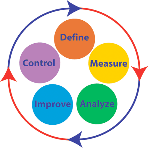
Define Measure Analyze Improve Control

The Six Sigma DMAIC Method applies to our industry perfectly

This should all encourage you to put yourself out there and try new things.  The best part of being your own boss in this business is that you can do whatever you want!  Try new campaigns, try more of the same campaigns, try anything that strikes your fancy.  Just make sure that when your hit campaign dries up, you will still have a paycheck at the end of the month.

You Can Do Better Than That

If you have worked and worked and finally got your first campaign profitable, congratulations!  Now it’s time to work some more.  You might think that just because you have made more money than you spent for the first time, you can sit on your butt and profit.  That’s one option, but that’s not the one that you should take.  You can do better than that.

Now it’s time to optimize that campaign.  What’s that you say?  It took optimization to get it profitable in the first place?  That’s great.  But now it’s time to optimize it some more.  If you are direct linking, it’s time to test out a landing page.  If you already have a landing page, it’s time to change up some elements on your page, or create a new page altogether.  I don’t care how much ROI you are getting on that campaign.  You can do better than that.

Key To Success

Little things matter.  On your landing pages, the color of the buttons matters.  The little picture in the corner matters.  The headline matters.  The body copy matters.  Also, test out a completely different look and feel on your landing page.  Start from scratch and do a new one with a completely different design style and concept.  Test this against the one that is already working.  If you are making money, don’t send all of your traffic to it, or even 50%.  Test it small with 10%-20% of your traffic.  If it beats your main offer (the “control”), then you swap it in and start the process all over.

One of the big things that separates the Super Affiliates from the little guys is that they spend a lot of time continuously working on their campaigns that are already making money.  Think about it, would you rather spend time getting more money out of a campaign that is already performing, or testing out 10 new ones to find that one that is going to make money at all?

Don’t get me wrong, I’m not saying you should never test out new campaigns.  You don’t want to have all your eggs in the same basket either.  What I am saying is that no matter how well your campaign is doing, you can do better than that.

Go get it.

Size Matters: PPV Landing Page Dimensions

As I’ve written about before, you need to get their attention in 4 seconds or less when you are doing PPV.  A huge part of this has to do with your landing page.  If you are direct linking, you need to pay special attention when selecting offers to make sure that the call to action and all the pertinent info is appearing in the viewable area of the pop-up browser window.  If it’s not, there is very little chance the users are going to scroll down just to see what the deal is.  If you are building landing pages, you have absolute control over the size and appearance of your page.  This is probably the #1 reason that people make landing pages for PPV, besides getting people more excited and getting them clicking.

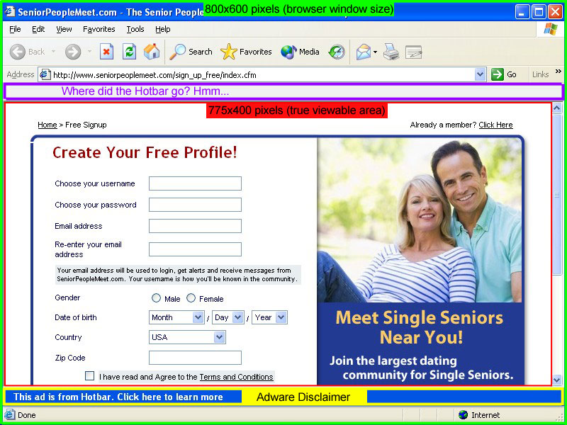
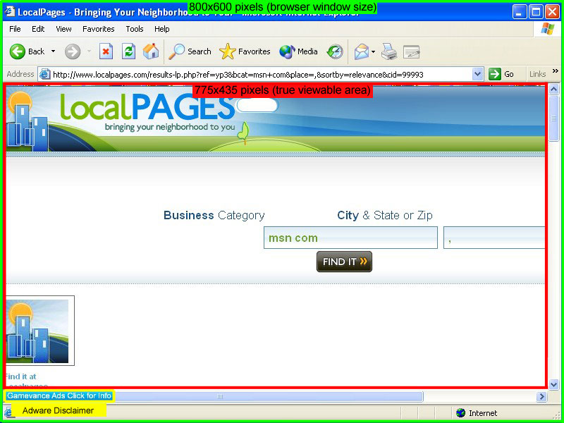
One question I get all the time is how big to make your pages.  It’s common knowledge that the pop-ups generated by PPV software are an 800×600 window.  But does that mean that you should design an 800×600 page?  The answer is NO.  I grabbed screenshots of some actual pop-ups spawned on my two favorite PPV Networks, TrafficVance and Lead Impact.  I’ve diagrammed them below so that you can see exactly what is going on.

Lead Impact Pop-Up Window

Lead Impact Example

Click Image for Full Scale Version

TrafficVance Pop-Up Window

TrafficVance Example

Click Image for Full Scale Version

First we have the actual browser window, which is definitely 800×600.  However, that measures from the outside of the window.  The actual viewable area is much smaller.  As you can see below, the TrafficVance window has 35 more pixels of height to work with in the viewable area than the Lead Impact window does.  This is because of the extra space that the Hotbar toolbar takes up in the Lead Impact window.  Is it retarded that Lead Impact leaves the Hotbar app in the window that it pops?  Yes.  It’s the stupidest thing ever.  But that’s the way it is.  Weird thing is, when I took the screenshot, the Hotbar magically disappeared from the picture.  It just shows up as a blank toolbar.  Interesting…

Not only does TrafficVance have a larger true viewable area, the Adware Disclaimer is also a lot smaller.  It’s just in the bottom left corner of the screen instead of a big blue bar all the way across the bottom like Lead Impact has.  The other major factor to keep in mind when comparing these networks is that TrafficVance only pops a maximum of 4 windows per day.  On the other hand, Lead Impact will pop on almost every single website that you visit.  This gets really annoying, even for me while I was doing the testing.  I can’t imagine how people leave it installed on their computer all the time…

So there you have it.  I always find that when going into battle (and marketing is a battle), it helps to have the best intelligence you can.  Now you know exactly what dimensions to design your landing pages in, or to double check that your direct link offers fit into.

Pro Tip: If you want a really easy way to measure how large the landing page is for your affiliate offer, just download ScreenHunter Free and set it to “Rectangular Area” in the “Capture What” menu.  Then hit whatever key you setup to be your capture key (I use PrintScreen), a box will appear around your mouse that zooms in the detail.  Just click and drag to highlight the landing page and it will tell you the dimensions.  If you want to go ahead and capture the screenshot, just let go of the mouse button.  If you don’t want the screenshot, just right-click before you let go of the left mouse button.

Uber Pro Tip: ScreenHunter is only for PC users.  But Mac users don’t need it because they already have that same function built-in to OSX.  Just press Command + Shift + 4 then you will be able to use the same type of rectangular box to measure your page.

Get Their Attention In 4 Seconds or Less

Another way to look at PPV marketing is interruption marketing.  That’s essentially what you are doing is interrupting them in the middle of their web surfing session and popping an ad in front of them.  What you have to say had better get your point across, and do it quickly.  Let me introduce you to the Golden Rule of PPV Marketing…

Get Their Attention In 4 Seconds or less.

That’s right, only 4 seconds.  That is the average amount of time it takes a user to mouse up and close the pop-up window or click “skip” on your interstitial ad.  Doesn’t sound like very much time?  It’s not.  That’s why you have to do everything in your power to keep them on the page and engage them before habit takes over, which is to close the window.  How do you get their attention?  Here are a few ways.

1. Audio

You can only use audio on your landing pages on two of the major PPV networks: Traffic Vance and Lead Impact.  Traffic Vance doesn’t have too many restrictions on audio, they are quite lenient.  However, Lead Impact requires that there be clearly visible controls to pause or stop the audio.  This is simple to do if you have the right software on your landing page.  The audio player I see being used the most often is Nifty Player.  It is lightweight, fast-loading, and you can have the controls on the page or keep them invisible if you choose.

2. Flashing Graphics

Take some cues from the animated flashing .gif banners that you see used on many of the blogs in this industry (like this one!).  It is super easy to make a 2-5 frame flashing .gif banner using Photoshop, but that’s a topic for another post.  There’s a great tutorial you can read here.  You can use this tactic to make flashing headers, blinking call to action buttons, and moving arrows to get the attention of the user quickly.

3. Use Opposing Colors

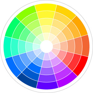
One way to catch the eye is to use opposing colors.  Using this color wheel you can easily pick colors on the opposite end of the spectrum, which makes pages much more eye-catching.  You probably don’t want to do anything too abrasive, like use one color for the background and then another for the text, that would just be annoying.  What you can do is use them for different buttons, arrows, or calls to action on the page.  Or when you make your animated .gif files you can use opposite colors and flash between them for maximum effect.

Using one or all of these tactics is a great way to get the user’s attention in 4 seconds or less.  Try these out, and you will definitely see a difference in your conversions.  Just put yourself in the mind of your user and ask yourself, “Would I close this window in 4 seconds?”

How To Direct Link On Google – Part 2

My last post has generated a lot of response and questions from people, so I wanted to discuss a couple of other points about the method that I outlined in Part 1.

First of all, there is the question of whether this method could get you banned from Google AdWords.  I would consider this a gray-area technique.  It’s not something that is an instant ban, but if you exploit it to a huge degree, then yes, it could lead to your account being terminated.

The reason that I posted this method is that it can be a great way to test out a campaign, but I can’t stress enough that you should be building landing pages for offers that have proven successful with the direct link method. It is very hard to build a long-term, sustainable business on the internet without creating a website.

Second, some people have questioned the ethics of using another site that doesn’t belong to you as the display URL.  The easiest response there is, if you don’t feel comfortable doing it, then don’t do it.  An alternative to using someone’s website is that you can use a domain that you own as the Display and Destination URL to get your ad approved, then switch the link to your affiliate link with Edit Keyword Settings like I suggested.  This way you don’t have to spend the time to build out a full dedicated landing page, but you are still using your own domain so you won’t get any complaints from other webmasters or feel bad about doing it.

I would also like to stress that the tutorials that I publish on this blog are not meant to be the absolute blueprint to success with affiliate marketing.  There is no such blueprint.  The goal with this blog is to give you, the reader, some good tips & advice to get going with some campaigns and marketing methods, and then you can tweak them and customize them to find what works the best for you.

There is a lot of money to be made in this industry, and it’s not always going to be easy.  It’s a lot easier than working 60 hours a week in a job that you hate to bring home just enough to keep the bill collectors at bay though…  Anything with the kind of potential that you have as an affiliate marketer is going to take some time to become successful at, but the rewards are definitely worth the effort that you put in.

That being said, I will continue to offer more strategies and tutorials, and I will do my best to answer your questions & comments to steer you in the right direction.  So keep reading, and keep the feedback coming!