As I’ve written about before, you need to get their attention in 4 seconds or less when you are doing PPV. A huge part of this has to do with your landing page. If you are direct linking, you need to pay special attention when selecting offers to make sure that the call to action and all the pertinent info is appearing in the viewable area of the pop-up browser window. If it’s not, there is very little chance the users are going to scroll down just to see what the deal is. If you are building landing pages, you have absolute control over the size and appearance of your page. This is probably the #1 reason that people make landing pages for PPV, besides getting people more excited and getting them clicking.
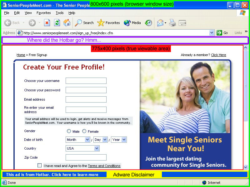
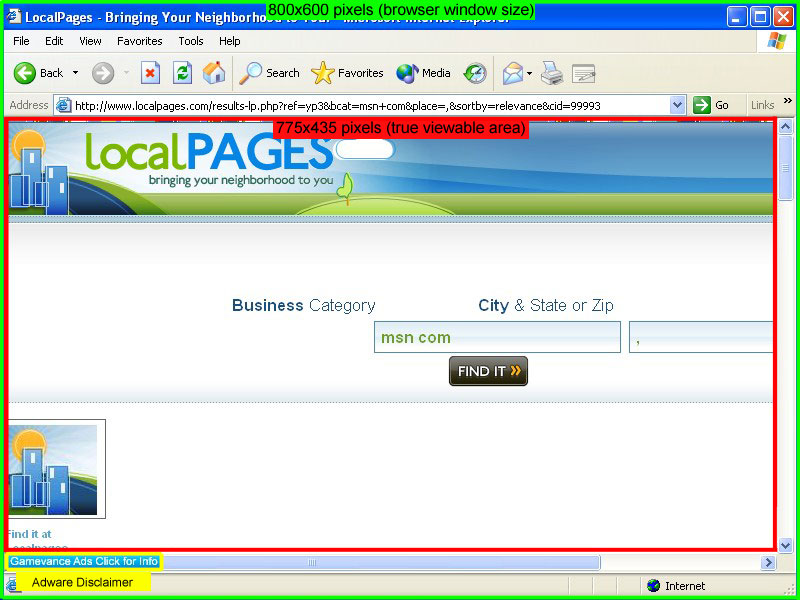
One question I get all the time is how big to make your pages. It’s common knowledge that the pop-ups generated by PPV software are an 800×600 window. But does that mean that you should design an 800×600 page? The answer is NO. I grabbed screenshots of some actual pop-ups spawned on my two favorite PPV Networks, TrafficVance and Lead Impact. I’ve diagrammed them below so that you can see exactly what is going on.
Lead Impact Pop-Up Window
TrafficVance Pop-Up Window
First we have the actual browser window, which is definitely 800×600. However, that measures from the outside of the window. The actual viewable area is much smaller. As you can see below, the TrafficVance window has 35 more pixels of height to work with in the viewable area than the Lead Impact window does. This is because of the extra space that the Hotbar toolbar takes up in the Lead Impact window. Is it retarded that Lead Impact leaves the Hotbar app in the window that it pops? Yes. It’s the stupidest thing ever. But that’s the way it is. Weird thing is, when I took the screenshot, the Hotbar magically disappeared from the picture. It just shows up as a blank toolbar. Interesting…
Not only does TrafficVance have a larger true viewable area, the Adware Disclaimer is also a lot smaller. It’s just in the bottom left corner of the screen instead of a big blue bar all the way across the bottom like Lead Impact has. The other major factor to keep in mind when comparing these networks is that TrafficVance only pops a maximum of 4 windows per day. On the other hand, Lead Impact will pop on almost every single website that you visit. This gets really annoying, even for me while I was doing the testing. I can’t imagine how people leave it installed on their computer all the time…
So there you have it. I always find that when going into battle (and marketing is a battle), it helps to have the best intelligence you can. Now you know exactly what dimensions to design your landing pages in, or to double check that your direct link offers fit into.
Pro Tip: If you want a really easy way to measure how large the landing page is for your affiliate offer, just download ScreenHunter Free and set it to “Rectangular Area” in the “Capture What” menu. Then hit whatever key you setup to be your capture key (I use PrintScreen), a box will appear around your mouse that zooms in the detail. Just click and drag to highlight the landing page and it will tell you the dimensions. If you want to go ahead and capture the screenshot, just let go of the mouse button. If you don’t want the screenshot, just right-click before you let go of the left mouse button.
Uber Pro Tip: ScreenHunter is only for PC users. But Mac users don’t need it because they already have that same function built-in to OSX. Just press Command + Shift + 4 then you will be able to use the same type of rectangular box to measure your page.


Superb post and very useful if your starting with cpv. I'll link to this from my ppv landing page design post. Top stuff.
Hello Josh,
It's the Awesome post. Really valuable for NON-US users like I'm. Because I have a one PC (and marketers do not recommend to USE TrafficVance and LeadImpact installed on the work machine).
I'm not sure about software, but I found the Jing have this functional as well. Please correct me, if I'm wrong here.
I have been using a piece of javascript code that automatically re sizes the window upon load. Do you think that is a good tactic?
Pingback: Recommended PPV Reading — PPV Playbook
Pingback: How To Create Advanced PPV or CPV Landingpages – Part 1 | Internet Marketing Rat
Thank-you. I was using 750×550 for my ads!
You say that your trafficvance window is 775×435. That’s not what I’m getting. Mine is 775×575. I tested on a few popular screen resolutions also, and it’s the same. Are you sure about that?
My measurement is for the actual viewable area of the page, not the window size itself. You have to subtract the menu bars, etc.
Pingback: Landing Page size? - CPV Den Members Forum
This may explain why my 800×600 pops were blowing ass!
Thanks for the post Josh 🙂
Hey, thanks for this. Would be cool if you could share the viewable area for other PPV networks. Cheers! Keep putting out good info.
Which ones would you like to see?
Do you know the dimensions for DirectCPV, and Media Traffic?
I have them on my post at https://insideaffiliate.net/the-big-5-ppv-networks…
Pingback: PPV Advertising: Network Reviews and Case Studies - Affiliate Marketing Tips from Super Affiliate Zac Johnson | Affiliate Marketing Tips from Super Affiliate Zac Johnson
If I didn’t read this post I will definitely never get any conversion for my PPV campaign. Thanks man for awesome post 😉
Cheers
Adi Rian
This is good information. I think a landing page works better as opposed to direct linking. I have not been able to get my ads to pop on my test computer!
Any thoughts or suggestions?
Thanks
Pingback: Landing Page Sizes - SEM Forums Blog
Pingback: Dumb PPV Questions - SEM Forums Blog
Pingback: PPV loading size - SEM Forums Blog