If you use social media at all (and I know you do), this new browser coming out called RockMelt is going to blow your face off. It’s based on the Google Chromium architecture, so it should look and feel familiar to Chrome users. I’ll definitely be giving it a try as soon as I can!
Checking In: Location Based Affiliate Programs?
Location based services have been all the rage lately. What was started by Foursquare and others has been expanded upon by Twitter and now Facebook. Now it seems like every social media website out there wants to know where you are located at all times. Personally I think it’s a bit odd that people are willing to share all that info with the general public. How long until thieves just sit on Foursquare and wait for people to check in at the local bar for the evening then head straight over to their house to rob the place? But that’s neither here nor there.

Remember playing the actual game of four square when you were a kid? Good times at recess.
All of the coverage about these services and seeing the shiny Check-In button on my Facebook Mobile app has got me thinking: will we soon see Affiliate Programs that take advantage of these services? Right now mobile and local advertising are still trying to gain traction with a larger number of advertisers in the industry. We have mobile pay-per-call campaigns like those provided by RingRevenue, so the check-in based offers can’t be far behind.
It would definitely lead to an interesting challenge. Not only do you have to get the consumer to click on an ad, but also follow through by going to a physical location and checking in? It all seems like a lot of work. But it could be worth it if advertisers are willing to pay for that kind of user engagement. Current ad campaigns that stores are running on Facebook Places and Foursquare are offering things like 20% of your total purchase at an H & M store if you check-in first. That’s a pretty significant value for the consumer as well as the store.
To me this just illustrates why I love this industry so much. There is always so much going on right at the cutting edge of technology that can give us new and exciting ways to make money and market products. Some may see this new location-based world as being a little too similar to the ads that Tom Cruise experienced in Minority Report, but I think we are a long way off from that. Besides, who cares? I’d rather see ads about things that are actually targeted to me and my interests any day.
Is Your Corner Store Split Testing You?
The short answer is yes. It’s funny how when you get into the online marketing world you start to see things in the real world differently. We are being marketed to at practically every second of every day in some way. After you’ve spent a lot of time optimizing online campaigns, split testing ad copy & landing pages, and improving your ROI, it gives you a new perspective.
Here’s an example: your local corner store / gas station / convenience store. When you walk into that store (if it is a franchise with a corporate office somewhere), you are already participating in a marketing experiment. The placement of every product and display in that store has been carefully thought out, just like the layout of your latest landing page. It’s a bit different when there are physical elements instead of just virtual real estate to fill out, but there are a lot of striking comparisons.
You know how we will split test whether a landing page converts better when the call to action button is on the left side of the page or the right side of the page? Corner Stores do that same thing with that beverage cooler that’s always on the way to the register. You know, the one full of ice and frosty beverages on a hot summer day? It’s been placed in the perfect position to suggest to you that you should buy a drink. Not too close to the middle of the path, that would be obtrusive. Not too far away from the path, because then you would just walk right past it. This is just one example of the split testing that goes on in these retail locations. Don’t even get me started on how a massive store like Walmart has planned and laid out the process of marketing to their customers while they are in the store. The sheer mechanics of it are mind boggling.
The reason I’m bringing this up is to point out that if we online marketers always keep our eyes open, we might pick up on some great new ideas to test out in the online realm. The brick-and-mortar stores have been doing this a lot longer than we have, and they have spent millions of dollars (if not billions) learning how to get the most out of every customer that walks through their door.
So the next time you walk into a gas station to pick up a snack or head into Best Buy to get the latest Blu-Ray release, keep your eyes open. You might learn something.
CPV Lab: Tested and Reviewed
CPV Lab came out a month or two back, and you couldn’t read a blog that had anything to do with PPV or CPV marketing without seeing an ad or a review for it. I read through a lot of them and they just went over the features that it had, but nobody had actually run any campaigns with it yet. I decided to hold off on my review until I used it as my main tracking solution for PPV campaigns for an entire month. So what’s the verdict? Read on…
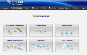
The install process for CPV Lab was relatively painless. Just upload it to your server, enter your MySQL database into into the config file, and run the installer script. Pretty much the same process as Prosper202 or any web-based script. After logging in, I did get the overall feeling that CPV Lab was designed to be lightweight and quick on its feet. There is not a lot of flashy interface design here, it is just the important info that you need to see quickly and it loads fast. I like that about it.
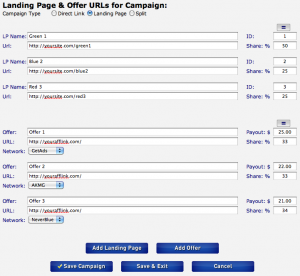
Setting up the first campaign with CPV Lab was a breeze. All you do is paste in your affiliate link and/or landing page URL, and tell it how you want to rotate things. I haven’t even been able to dive in deep and try all of the advanced campaign types that this thing allows, but the primary Direct Link / Landing Page campaign type works like a dream. You can just set up one direct link campaign, or rotate several. You can set up one landing page, or rotate several. But then, you can rotate multiple offers on the backend of each of those landing pages. And you can also split test the landing pages against the direct link offers (one or many), all at once. And you can choose the weight for each of these rotating factors. If you want to test one at 10% and one at 90% of the traffic, CPV Lab has you covered. Mind = blown.
Once you set up the campaign, you get your link and put it in your campaign at the PPV network and you are good to go. It has several pre-made variables set up for the dynamic keyword insertion tokens for each network, so that makes it easy to get the subid tracking working correctly. All of this went pretty much as I expected, although I was definitely impressed by the number of rotation options. But the true beauty of CPV Lab doesn’t reveal itself until you actually have traffic live and running.
In PPV campaigns, you have to change things a lot. This is a pain because you have to get your page re-approved by the PPV network with every change that you make. At least that’s how it used to be. The #1, awesome, truly amazing thing about CPV Lab is that once you create your campaign, the tracking URL never changes! You can add and remove offers & landing pages, change rotation weights, and make any changes you want to the campaign without ever having to get re-approved by the PPV network. This is a massive time saver, and worth the price of admission by itself.
After you’ve got enough traffic to start analyzing the stats, CPV Lab shines again with its built-in optimization features. It will automatically highlight winning and losing targets and keywords on your stats page, based on metrics that you set on the settings page. If you want to consider every keyword that has more than a 25% ROI a winner, you can do that. If you want to make everything that has received more than 100 reviews without a conversion a loser, you can do that. The options are limitless. This takes all the guesswork out of optimizing your campaigns and lets you focus on creating new ones. It will also show you Time & Day trends so you can set up day parting.
You can track conversion in real time with a pixel, and it fires much more consistently than the P202 pixel ever did for me. To get the actual cost data in there, you can upload the reports from your PPV network as often as you’d like. This allows you to calculate the proper cost per keyword, not just for the campaign overall. This was another thing that you couldn’t do with P202 for PPV campaigns. If you are paying $0.20 a view on one URL and $0.01 a view on all the other ones in your campaign, you better be dang sure that you know the difference when you are looking at your conversion stats and optimizing your campaign! CPV Lab does this beautifully.
Bottom line, if you run PPV traffic, you need to get CPV Lab. It will make you more productive, help you optimize your campaigns, and save you so much time doing it you will be dumbfounded. I know this review might come out sounding like a sales letter, but I have never been so impressed with a piece of software in this industry, ever. Not to mention there are new add-ons coming soon to work with Facebook, Plenty of Fish, etc.
Do yourself a favor and buy it now. If you buy through my link, I would be more than happy to help you with any CPV Lab questions or troubleshooting that you need. I also am good friends with the creator, Robert Matthew, so if I can’t answer your question I’ll get it straight from him.
Bottom line: CPV Lab is amazing. You are losing money by not using it. I have used it personally on every PPV campaign for the last month, and I will not be going back. Ever.
Disclosure: http://cmp.ly/5
The Campaign Is Over, What Now?
When you’ve got a hot campaign rolling, it’s the best feeling in the biz. You are making money. Your hard work is paying off. Time to take it easy and spend some money right? Wrong! That’s what you might be tempted to do, but in fact it’s time to buckle down. Sooner or later you are going to get that dreaded email from your network: “The offer is paused”. But how could this happen?!? It happens to every campaign sooner or later. If you are lucky, there are other offers in the niche that you can switch over to. With ringtones, for example, there are always a bunch of different offers to test against each other. But if you are in something very specialized, then you might not be so lucky. So since you need to get the gears turning again, let’s see what we can do to find the next campaign.
1. Ask your AMs for Advice
Affiliate Managers can be a huge asset to you when you are open to new ideas. They will be far more helpful when you approach them looking for suggestions. They don’t just want to sit there all day pushing offers to non-interested affiliates. Put them to work! Tell them what you’ve been running. Not everything of course, but tell them what offers are working so that they can give you more suggestions.
2. Test, test, test
This is where you put all of your inhibitions aside and try out things that you were too scared to try before you had some success. You’ve had at least one successful campaign already, so there is nothing stopping you from doing it again. You would be surprised how many of the most profitable campaigns came from things that marketers just tried on a whim, not thinking that they would be successful. You can never predict what’s going to hit and what’s not. Be a little more creative, think outside the box, try it out!
3. Find new Traffic Sources
There are so many traffic sources out there you would have a full time job just trying to test them all. This might be a good time to try your hand at one or two new ones and see how they work. You never know, maybe something about it will open up a whole new niche or campaign for you that had previously stumped you. Different platforms have different targeting options and possibilities for you to exploit. This ties back in to #2: be creative with your Traffic Sources as well!
4. Analyze your success
What was it about that successful campaign that made it a winner? At what point did you really break through? Was it profitable from the beginning or did you have to tweak it? Did you use a landing page or direct link? Where did you hear about that campaign? Did you think it was going to be successful when you tried it? Asking yourself these questions will bring you to some very interesting answers. A lot of times you will completely forget how you actually stumbled onto a profitable campaign and just how easy it was to do. There wasn’t anything magical about it. In most cases you were just following a simple process of testing and exploring that led to a profit. The good news is, this can be repeated!
This should all encourage you to put yourself out there and try new things. The best part of being your own boss in this business is that you can do whatever you want! Try new campaigns, try more of the same campaigns, try anything that strikes your fancy. Just make sure that when your hit campaign dries up, you will still have a paycheck at the end of the month.
A New Challenge
It was only 5 short months ago that I joined the team over at GetAds. I’ve known them for years and it was a natural fit. In fact, things have gone so well that I was promoted this week to Marketing Manager. This is going to be an awesome challenge and opportunity for me to help grow the company as a whole, but I will be pulling back from managing affiliate accounts. The good news is, if you were working with me as an affiliate (or thinking about signing up), you will still be able to work with one of top AM’s in the industry. We only hire the best at GetAds.
So what will I be doing as Marketing Manager? For one, I’ll be taking over the GetAds Blog. If you haven’t read it before, definitely add it to your RSS reader. I’ll be blogging there regularly and there will be exclusive posts you can’t find anywhere else. I also am taking over our ad campaigns. The goal is to have as many active affiliates as humanly possible in our network. I will be in charge of promotions and contests, and other snazzy stuff to try and get you to run with GetAds.
Bottom line, my job is to increase the revenue for the company as a whole. It will be a definite switch from working with affiliates as an AM on a daily basis, but I’m looking forward to the challenge and I’m grateful for the opportunity. I’m always about trying new things and finding new ways to make more money for myself and my company.
Don’t worry, I’m still running affiliate campaigns on the side, and I’ll still be blogging here regularly as well. So don’t touch that dial. I just wanted to give you an update on what’s going on, in case you are one of my affiliates and suddenly logged in to see a different pic up in the top right-hand corner.
You Can Do Better Than That
If you have worked and worked and finally got your first campaign profitable, congratulations! Now it’s time to work some more. You might think that just because you have made more money than you spent for the first time, you can sit on your butt and profit. That’s one option, but that’s not the one that you should take. You can do better than that.
Now it’s time to optimize that campaign. What’s that you say? It took optimization to get it profitable in the first place? That’s great. But now it’s time to optimize it some more. If you are direct linking, it’s time to test out a landing page. If you already have a landing page, it’s time to change up some elements on your page, or create a new page altogether. I don’t care how much ROI you are getting on that campaign. You can do better than that.

Little things matter. On your landing pages, the color of the buttons matters. The little picture in the corner matters. The headline matters. The body copy matters. Also, test out a completely different look and feel on your landing page. Start from scratch and do a new one with a completely different design style and concept. Test this against the one that is already working. If you are making money, don’t send all of your traffic to it, or even 50%. Test it small with 10%-20% of your traffic. If it beats your main offer (the “control”), then you swap it in and start the process all over.
One of the big things that separates the Super Affiliates from the little guys is that they spend a lot of time continuously working on their campaigns that are already making money. Think about it, would you rather spend time getting more money out of a campaign that is already performing, or testing out 10 new ones to find that one that is going to make money at all?
Don’t get me wrong, I’m not saying you should never test out new campaigns. You don’t want to have all your eggs in the same basket either. What I am saying is that no matter how well your campaign is doing, you can do better than that.
Go get it.
Size Matters: PPV Landing Page Dimensions
As I’ve written about before, you need to get their attention in 4 seconds or less when you are doing PPV. A huge part of this has to do with your landing page. If you are direct linking, you need to pay special attention when selecting offers to make sure that the call to action and all the pertinent info is appearing in the viewable area of the pop-up browser window. If it’s not, there is very little chance the users are going to scroll down just to see what the deal is. If you are building landing pages, you have absolute control over the size and appearance of your page. This is probably the #1 reason that people make landing pages for PPV, besides getting people more excited and getting them clicking.
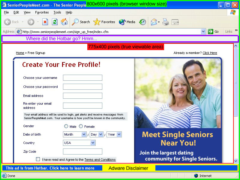
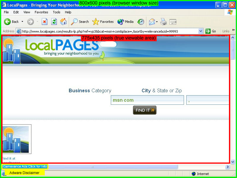
One question I get all the time is how big to make your pages. It’s common knowledge that the pop-ups generated by PPV software are an 800×600 window. But does that mean that you should design an 800×600 page? The answer is NO. I grabbed screenshots of some actual pop-ups spawned on my two favorite PPV Networks, TrafficVance and Lead Impact. I’ve diagrammed them below so that you can see exactly what is going on.
Lead Impact Pop-Up Window
TrafficVance Pop-Up Window
First we have the actual browser window, which is definitely 800×600. However, that measures from the outside of the window. The actual viewable area is much smaller. As you can see below, the TrafficVance window has 35 more pixels of height to work with in the viewable area than the Lead Impact window does. This is because of the extra space that the Hotbar toolbar takes up in the Lead Impact window. Is it retarded that Lead Impact leaves the Hotbar app in the window that it pops? Yes. It’s the stupidest thing ever. But that’s the way it is. Weird thing is, when I took the screenshot, the Hotbar magically disappeared from the picture. It just shows up as a blank toolbar. Interesting…
Not only does TrafficVance have a larger true viewable area, the Adware Disclaimer is also a lot smaller. It’s just in the bottom left corner of the screen instead of a big blue bar all the way across the bottom like Lead Impact has. The other major factor to keep in mind when comparing these networks is that TrafficVance only pops a maximum of 4 windows per day. On the other hand, Lead Impact will pop on almost every single website that you visit. This gets really annoying, even for me while I was doing the testing. I can’t imagine how people leave it installed on their computer all the time…
So there you have it. I always find that when going into battle (and marketing is a battle), it helps to have the best intelligence you can. Now you know exactly what dimensions to design your landing pages in, or to double check that your direct link offers fit into.
Pro Tip: If you want a really easy way to measure how large the landing page is for your affiliate offer, just download ScreenHunter Free and set it to “Rectangular Area” in the “Capture What” menu. Then hit whatever key you setup to be your capture key (I use PrintScreen), a box will appear around your mouse that zooms in the detail. Just click and drag to highlight the landing page and it will tell you the dimensions. If you want to go ahead and capture the screenshot, just let go of the mouse button. If you don’t want the screenshot, just right-click before you let go of the left mouse button.
Uber Pro Tip: ScreenHunter is only for PC users. But Mac users don’t need it because they already have that same function built-in to OSX. Just press Command + Shift + 4 then you will be able to use the same type of rectangular box to measure your page.
Writer’s Block
So I haven’t posted in the month of September yet, and it’s half over. Not good. For some reason I’ve got writer’s block this month and can’t think about anything to blog about. So it’s up to you guys now, tell me what you want to hear about! Just post in the comments and tell me something that you’d like to know more about, problems you’ve been having with your marketing efforts, or whatever strikes your fancy.

Thanks in advance!


