Another way to look at PPV marketing is interruption marketing. That’s essentially what you are doing is interrupting them in the middle of their web surfing session and popping an ad in front of them. What you have to say had better get your point across, and do it quickly. Let me introduce you to the Golden Rule of PPV Marketing…
Get Their Attention In 4 Seconds or less.
That’s right, only 4 seconds. That is the average amount of time it takes a user to mouse up and close the pop-up window or click “skip” on your interstitial ad. Doesn’t sound like very much time? It’s not. That’s why you have to do everything in your power to keep them on the page and engage them before habit takes over, which is to close the window. How do you get their attention? Here are a few ways.
1. Audio
You can only use audio on your landing pages on two of the major PPV networks: Traffic Vance and Lead Impact. Traffic Vance doesn’t have too many restrictions on audio, they are quite lenient. However, Lead Impact requires that there be clearly visible controls to pause or stop the audio. This is simple to do if you have the right software on your landing page. The audio player I see being used the most often is Nifty Player. It is lightweight, fast-loading, and you can have the controls on the page or keep them invisible if you choose.
2. Flashing Graphics

Take some cues from the animated flashing .gif banners that you see used on many of the blogs in this industry (like this one!). It is super easy to make a 2-5 frame flashing .gif banner using Photoshop, but that’s a topic for another post. There’s a great tutorial you can read here. You can use this tactic to make flashing headers, blinking call to action buttons, and moving arrows to get the attention of the user quickly.
3. Use Opposing Colors

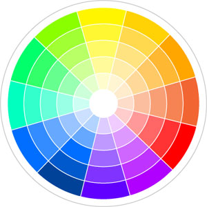
One way to catch the eye is to use opposing colors. Using this color wheel you can easily pick colors on the opposite end of the spectrum, which makes pages much more eye-catching. You probably don’t want to do anything too abrasive, like use one color for the background and then another for the text, that would just be annoying. What you can do is use them for different buttons, arrows, or calls to action on the page. Or when you make your animated .gif files you can use opposite colors and flash between them for maximum effect.
Using one or all of these tactics is a great way to get the user’s attention in 4 seconds or less. Try these out, and you will definitely see a difference in your conversions. Just put yourself in the mind of your user and ask yourself, “Would I close this window in 4 seconds?”


I love that opposing color trick. I use it all the time when building ads for private sites/blogs and find it usually works VERY well.
Thanks Josh!
is that button available for download. lol
true or false, profit addiction is a highly sophisticated comment bot.
I think he's got an RSS reader that emails him, texts him, sends a messenger to his door, and rings a fire alarm in his office every time a blog post in this industry is published.
I'm proud (or maybe I'm not) to say that I've beat Jeremy to a few posts before. 🙂
BTW – great blog post. Be careful with #2 – might give some one a seizure with that thing, whoa.
If they get a seizure, then they will stay on the page for more than 4 seconds, yes? 😉
Very helpful article, I'm going to implement the flashing lights in a few of my PPV creatives today to see how it affects CTR.
I keep running into the problem of pausing campaigns too quickly because my CTR is low after 100-200 views (around 1-2%). Running email submits and assuming a 30% end conversion rate, I cannot see how it is possible to profit without a CTR of at least 4%.
Do you split test landing pages at the beginning of a campaign? Or do you gather data for one of them until you hit 3x your spend, then test the other?
Would really appreciate some input, thanks!
For CTR, you really need to test audio on your page. The other methods will help too, but that is the #1 way to boost it. You can split test as many variables at once as you want, but you have to be willing to spend more because you really need to spend enough on each variable to see if it is working or not. So if you are testing targets, landing pages, and offers all at the same time, you could spend more than 3x the payout total.
Pingback: How To Create Advanced PPV or CPV Landingpages – Part 1 | Internet Marketing Rat
Pingback: Size Matters: PPV Landing Page Dimensions — Inside Affiliate